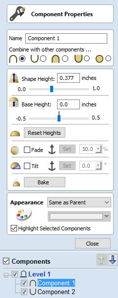
Component Properties

The Component Properties form allows you to adjust a number of dynamic properties for a selected Component or Level. Adjusting these properties does not make permanent changes to your Components and can be further edited or reset any time until the component is Baked, in which cases they will be made permanent in the Component shape and this form will be reset.
Multiple Selections
If you have more than one component selected while using the Component Properties tool, Aspire will apply the changes to all the selected components. Some properties where this would be inappropriate (such as the component's name) are grayed-out when there is more than one component selected. These properties must be applied to components one at a time.
Combine with other components
The Combine Mode dictates how the components (or Level) are combined with the objects below them in the Component Tree. This is done by the software starting at the bottom of the list and working upwards. The first level and first component's combine mode determines only how it combines with the modeling plane. The second and subsequent components are combined with the result of everything below them based on their Combine Mode as detailed below. There is additional information and diagrams of the result of these choices in the 3D Design section of this document.
See Component Management from within a modeling tool for more information.
 Add
Add
Adds the selected component/s to the result of all the previous components in the list
 Subtract
Subtracts the selected component/s from the result of all the previous components in the list
 Merge
Merge
Where they overlap, this Merges the selected component/s into the result of all the previous Components in the list keeping the highest part of the overlapping area. This means the higher part of each shape will be what remains in this area.
 Low
Low
Where they overlap, this Merges the selected component/s into the result of all the previous Components in the list keeping the lowest part of the overlapping area. This means the lower part of each shape will be what remains in this area.
 Multiply
Where there is an overlap, this Multiplies the result of all the previous components in the list by the heights in this component.
Shape Height
Use the slider or type in a specific percentage to scale the height of the selected Component(s) up or down based on its current height (100%).
Enter a value in the Shape Height edit box directly, or use the slider to adjust the height of your component selection interactively. In either case, the 3D view of the component will update automatically as you adjust the value. The range of available heights on the slider is determined by your current material thickness setting. If these values appear to be inappropriate you can still enter any value you like into the associated edit box, or you can close the tool and select Edit ► Job Size and Position from the main menu. In the Job Setup page you can then correct the current setting for the material thickness before continuing.
Base Height
Enter a specific value into this box to raise the Component or Level up on a flat plane of the thickness you specify. This can be useful to help move an object up so it sits proud of another component it is Merging with. If you are not sure of the value you need, then enter an amount and hit the space bar to apply this. If this is not correct, type in another value and hit space again to apply the new value, look at the 3D View to judge the result - repeat until you get the value you need.
You can also apply a Base Height to a Level. Adding a base height to a level will add the same base height visually to the components in that Level, however the components themselves will have no base height added to them within their properties. This is useful to raise a set of objects on a Level above things that need to appear to be behind them (for example above a textured area).
Reset Heights
The button will remove the dynamically applied Shape and Base height settings from the selected component. To reset the Base Height back to zero using the slider control, double click the central line marker above the slider bar.
Fade
When this option is checked ✓ the user can fade the Z depth of the Component. The first part of this operation (once the option is checked ✓) is to select the button - then click two points in the 2D view. The first click specifies the point which will remain at the current height. The second click specifies the point that the Component will be faded down toward. The shape will fade down from the first point to the second by the percentage selected. Change the strength of the fade by clicking the down arrow next to the percentage value and using the slider to move this up and down or type in a specific value for the amount you would like to reduce the depth by. The fade will be applied linearly between the two selected points. This is a useful tool for giving the effect of a Component fading into the distance to help with overlapping areas of Components if you want to lower an area to give it the appearance of going behind another one.
Tilt
When this option is checked, ✓ the user can set a direction and angle to tilt the Component up in the Z axis. The first part of this operation (once the option is checked ✓) is to select the button - then click two points in the 2D view. The first click specifies the point which will not move (the pivot point of the tilt). The second click specifies the point that will be tilted upwards by the specified angle (the point that will be raised up). Change the tilt angle by clicking the down arrow next to the value, you can use the slider to alter this, or type in a specific value for the angle. This is an extremely useful function for raising a part of one Component above another one when they overlap, without having to raise the whole Component up using the Base Z Position option. In some cases this allows the overlapping areas to sit proud without having to create a deep raised wall around the whole edge of the Component.
The Bake button
Sometimes it's useful to apply a component's dynamic properties permanently, one example where this is useful is so that further dynamic changes can be applied 'on top' of previous ones. To do this, use the button.
Appearance
Aspire gives you a lot of control over the appearance of the 3D shaded image for visualization purposes, such as customer approval proofs or marketing material. Each component can be given an individual color or material:
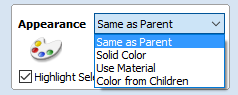
Color Options
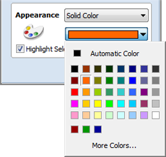
Solid Color palette with More Colors
Use Material
When this is selected the user can choose from the list of pre-defined material effects by clicking on the box immediately below the Appearance choice. These include many wood grains, metal effects, stone and plastic.
Additional materials can be added to the library list by copying an image file (JPG, BMP or TIF) of the material or image into the relevant materials folder on your computer. To find the Materials folder on your computer, use the menu command File ► Open Application Data Folder....Then open the folder Bitmap Textures. Either copy your new textures into one of the existing folders, or create a new folder and add them there.
Color from Children
This option is used for a Group of Components and will allow the software to use the individual colors and materials assigned to the groups constituent Components to display in the shaded image even though it is a Group. If this option is not selected the Group will be given its selected Color or Material.
Highlight Selected Component
When choosing a material or color to use for a particular component, the red selection highlighting of the component can prevent you from seeing your chosen material accurately in the 3D view. You can un-check this box to temporarily disable the red highlighting while you make your selections. This option will automatically be re-enabled on exiting the Component Properties page.
Close
The button will exit the Component Properties form and return to the standard set of modeling icons.